Author: Sandeep Gulati
Published: July 9, 2025 | Updated: July 23, 2025Your living room is the heart of your home—a space where you relax, entertain guests, and make lasting memories. The colours you choose play a significant role in setting the mood, enhancing aesthetics, and reflecting your personal style. But with endless shades and combinations available, selecting the perfect colour palette can feel overwhelming.
In this guide, we’ll walk you through essential colour theory, trending hues, and practical design strategies to help you curate a living room that feels inviting, stylish, and uniquely yours.
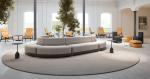
Colores influence emotions and perceptions. Before deciding on a palette, consider the atmosphere you want to create. Warm colours like red, orange, and yellow add energy and are perfect for social spaces, while cool colours such as blue, green, and purple create a calming and serene ambiance. Neutral tones like beige, grey, and white offer versatility and timelessness, making them suitable for any aesthetic. Earthy hues like terracotta, olive, and mustard add a cozy and grounded feel to your living space.
If you frequently host guests, warm tones foster a welcoming ambiance. If your living room is a place of retreat, cooler hues can help create a tranquil effect.
✨Design Tip: If you’re unsure about committing to bold colours, start small with decor pieces like pillows, artwork, or throws to test how different shades feel in your space.
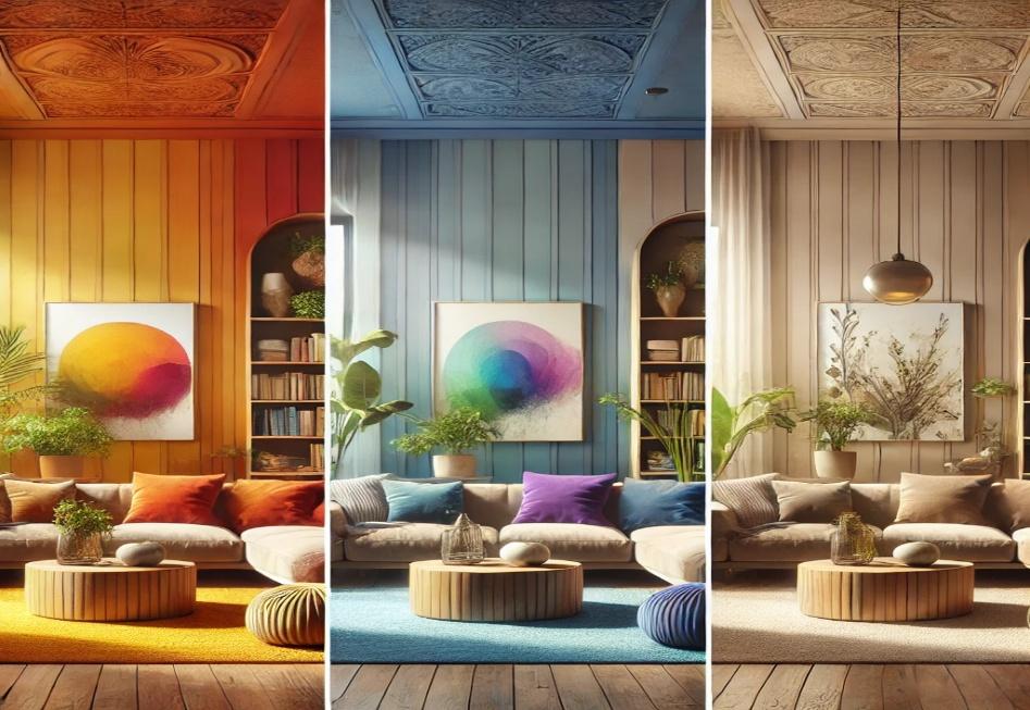
A side-by-side comparison of three living rooms, each showcasing a different colour scheme based on colour psychology: warm tones, cool tones and neutral tones (beige, for a timeless and versatile look.
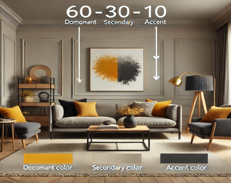
A well-designed living room follows the 60-30-10 rule to maintain balance and cohesion. The dominant colour makes up 60% of the room and is reflected in the walls and large furniture pieces. The secondary colour covers 30% and is typically found in sofas, rugs, and curtains. The remaining 10% consists of an accent colour, which is introduced through small decor items, pillows, and artwork.
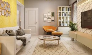
For example, a neutral elegance theme could consist of soft beige as the dominant colour, charcoal grey as the secondary colour, and mustard yellow as the accent. A modern monochrome look might include light grey, deep navy blue, and gold accents. If you prefer a nature-inspired aesthetic, sage green, warm brown, and soft white can bring a calming effect to your space.
✨Design Tip: Stick to three main colours to keep your space cohesive, and use different textures like wood, linen, or metallic finishes to add depth and variety.
Lighting plays a crucial role in how colours appear in your living room. Rooms with ample natural light can benefit from cooler tones to balance brightness, while north-facing rooms, which receive less sunlight, can feel warmer and cozier with rich, warm colours. If you have a small space, lighter shades can create an illusion of openness, while larger rooms can benefit from darker tones to add warmth and intimacy.
Before finalizing your colour selection, always test paint swatches under different lighting conditions to see how they change throughout the day.
✨Design Tip: Use mirrors strategically to reflect natural light and enhance the colour vibrancy in your space.
The colour palette you choose should align with your preferred aesthetic. Classic and timeless designs often feature beige, cream, and taupe for a warm, neutral backdrop, with rich browns and deep greens adding a cozy, traditional feel. For a bold and modern look, black, charcoal, and gold create a dramatic, high-end appearance, while navy and white offer a sophisticated contrast.
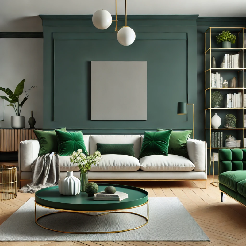
Nature-inspired and organic palettes incorporate earthy greens, soft browns, and terracotta for a grounded, natural atmosphere, with sage green and warm grey bringing a sense of calm. Minimalist and contemporary styles focus on shades of white and grey for a clean, sleek look, with soft pastels like dusty pink and muted blue adding subtle elegance.
✨Design Tip: Mix matte and glossy finishes within the same colour palette to add visual interest without overwhelming the space.
If you’re not ready to commit to a full-room colour change, using accents can add a stylish touch. Painting one wall in a bold shade such as emerald green or burnt orange can serve as a focal point. Artwork and wall decor, such as framed paintings or gallery walls, can introduce colour without overwhelming the space. Furniture like a statement sofa or an eye-catching bookshelf can also add visual interest.
For a temporary option, rugs, textiles, patterned throw pillows, and curtains can inject a pop of colour while maintaining flexibility in your design. Renters can consider removable wallpaper as a non-permanent way to personalize their space.
✨Design Tip: When choosing an accent colour, pick one that contrasts yet complements your primary palette to create an eye-catching but harmonious look.
Choosing between paint and wallpaper depends on style, budget, and maintenance preferences. Paint is affordable, versatile, and easy to update, making it a popular choice for those who frequently redecorate. Wallpaper, on the other hand, adds texture, patterns, and a touch of luxury, providing a more customized look.
Different paint finishes also affect the final look of your space. Matte finishes offer a soft, elegant appearance but can show marks easily. Eggshell and satin finishes provide a low-shine surface that is easy to clean, making them ideal for families. Semi-gloss finishes are more reflective and work well for accent walls.
If you’re looking for a cost-effective yet stylish option, consider using paint for most walls and incorporating wallpaper on one accent wall for added dimension.
✨Design Tip: Use textured wallpaper or a subtle mural to create an artistic focal point without overwhelming the space.
Designing your living room’s colour palette doesn’t have to be stressful. By considering colour psychology, natural light, and popular styles, you can create a space that is both stylish and functional.
To recap, determine the mood you want to set, follow the 60-30-10 rule for balance, test colours in different lighting, and explore trending colour palettes for inspiration. Accent walls and statement pieces can add personality, while the choice between paint and wallpaper allows for creative flexibility.
Which colour palette are you drawn to? Let us know in the comments!
Want more home decor insights? Subscribe to our newsletter for the latest trends and expert tips!✨Design Tip: Don’t forget to incorporate plants! Greenery adds a natural vibrancy that enhances any colour scheme while purifying the air.